Find Bar Feng Shui

findbar-new.png

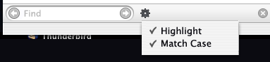
I have always thought the UI for Firefox’s Find Toolbar has room for improvement. Recently the Match Case checkbox was added to the bar, increasing the amount of horizontal space it requires. This becomes a problem when the find bar is used in the Help window, where a portion is clipped off unless you widen the window.

I made a Photoshop mockup of how an alternate find toolbar might look. This probably isn’t *the answer* – just starting point for a discussion. What do you like and dislike about the find toolbar, and what should we do about it?

"Live Bookmarks" is not RSS

A few days ago we changed Firefox’s Live Bookmarks status icon to something less geeky.

Live Bookmarks status icon before and after

As people rightly pointed out, Live Bookmarks shouldn’t pretend to be RSS. The status bar icon should not represent multiple flavors of a syndication format. It should represent the Live Bookmarks feature.

Here are some of Stephen Horlander’s original sketches for a replacement Live Bookmark icon

Live Bookmark icon sketches by Stephen Horlander

Initially the RSS button design was suggested by members of the Mozilla Visual Identity team. At the time, it seemed natural that we’d want to use something similar to the semi-ubiquitous orange RSS chiclet found on web sites that offer news feeds. I even rationalized that RSS is becoming an almost generic term for news feeds, and even though Live Bookmarks supports RSS and Atom, an icon that said “RSS” wouldn’t confuse people. What the heck, Apple does it too!

But that’s a poor excuse. You shouldn’t need to know what RSS or Atom is to use Live Bookmarks.

Pretty Widgets, Part 2

widgets2.png

Here’s a followup on my attempt to make the HTML widgets on Mac Firefox presentable. I’ve had to make some compromises here to get the widgets to look nice, for instance I force the background-color and -image on buttons. And text box borders usually use my colors rather than the ones specified by the web page CSS. For these reasons these styles would probably not be acceptable for inclusion in Firefox, but in most cases I’ve found these to be more comfortable than the primitive default widgets.

Instructions: Close Firefox. Right-click on your Firefox application, choose “Show Package Contents”, and then open the Contents > MacOS > res folder. Make a backup copy of your platform-forms.css file. Then copy these files into the res folder:

Important: If you followed my instructions in the previous blog post to modify your userContent.css file, either delete it or remove my additional code before trying out the new and improved widgets.

A little bug: I’m not sure how I can get rid of the black border around the inside of the selected select box. Please let me know if you have any comments or suggestions for improvements!

Pretty Widgets

Inspired by Jon’s attempt to make Mac Firefox HTML form widgets a little easier on the eyes, I’ve taken a shot at making a set of widget styles that blends with Mac Firefox. It has focus rings too!

widgets.png

Instructions: Download the userContent.css file and copy it to your ~/Library/Application Support/Firefox/Profiles/(profile name)/chrome folder. Or add the code within to your existing userContent.css file. It’ll look best on a recent Firefox branch build.

Mac Firefox Icon Update

I just checked in new revisions of the back, forward, reload and stop icons for Mac Firefox by icon wizard Stephen Horlander. These new buttons attempt to address the critics of the previous set, and they share their shapes with the Windows Firefox theme. We went with a more colorful toolbar this time instead of making the nav icons all blue. This will probably be the final major change before Firefox 1.0 is released.

newernavicons.png

[ Update: Download the latest Firefox nightly build to see the new icons ]

The Browser, Redesigned: Take Two (or 0.2)

 
winstripe 0.2 toolbar

[ This post is by Stephen Horlander, the designer behind the majority of the Firefox icons. – Kevin ]

After the release of “Winstripe” into the wild there was a large and varied response. Ranging from mindless petulant rants and demands, to well thought out critiques. Lets just say there were more of the former than the latter. Even before it’s inclusion in Firefox I was personally less than thrilled about how it turned out. The idea, as you may have read, was to take the icons from Pinstripe and make them fit into a Windows environment. The theory was sound as the icon concepts used in Pinstripe were, I feel, fairly strong. Due to time constraints and my own admittedly limited familiarity with more recent incarnations of Windows I think they failed on this count. They do however work well enough and are a good deal better than most of the icons used by many Windows applications, in my biased opinion anyway : )

Continue reading “The Browser, Redesigned: Take Two (or 0.2)”

Mozilla Firefox!

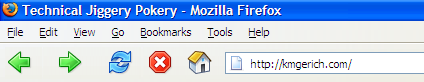
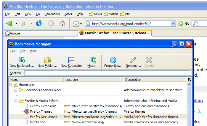
New Name. New Look. New Icon. The program formerly known as Phoenix and Mozilla Firebird has just released version 0.8. This version is faster and more stable than before and has more neat features than you can shake a stick at. Check the release notes. It also features the Pinstripe theme as the new default look on Mac OS X. Download it here!

Note: The Firefox UI may appear broken if you are using a previous version of the Pinstripe theme. Go into your theme preferences, select “Firefox (default)”, then close and reopen the browser to make sure you are using the latest incarnation of the Pinstripe theme.